


 2022-05-25
in
2022-05-25
in

 8 min read
As I frequently lament the over-concentration of money, power, and control into the same few big companies I try to counter that by looking at alternatives. One I found which works okay but not great has been Bookshop.org as a replacement for Amazon. Their prices are a bit higher and delivery times a bit longer but their big advantage is that they are networking small bookshops and providing ways to see what is in local bookshops that you can visit rather than it always be delivery. The biggest detractor for me isn’t any of the above. It is that I don’t generally want to buy or read hard copy. I want to buy digital books. In the past I’ve used Kodo, Kindle, and some other readers. I even started working on my own mobile e-book reader to run under Blackberry a long time ago (that went nowhere of course). While exploring Bookshop I noticed they had a tie in to an e-book platform named MyMustReads . I therefore decided to give it a try to see how I liked it. I wish I could say I was so blown away it’d be easy to ditch Kindle for this but sadly that is not the state of affairs.

Interface Walk
When launching the app you are presented with the usual library view of things in the store, your library etc.
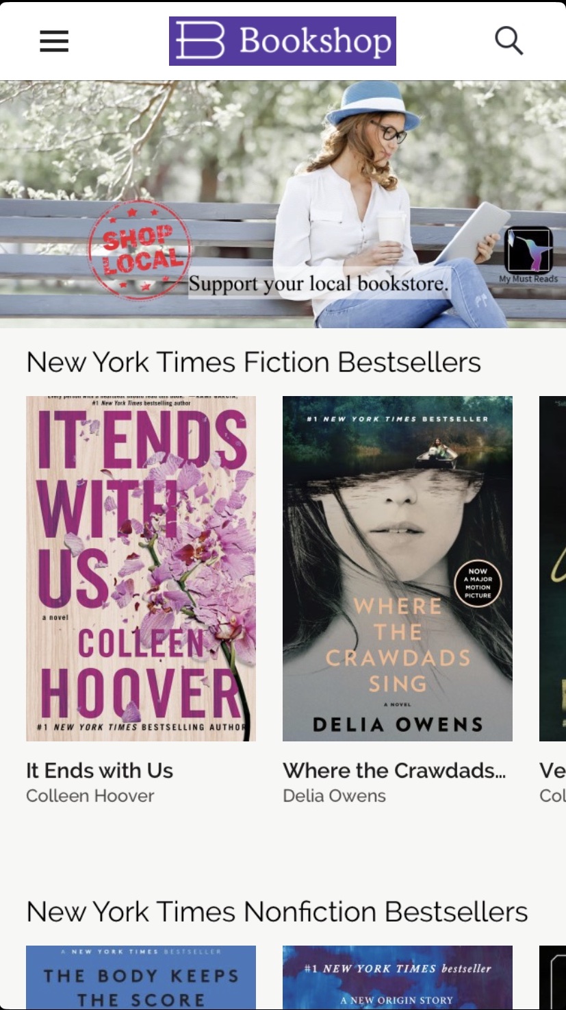
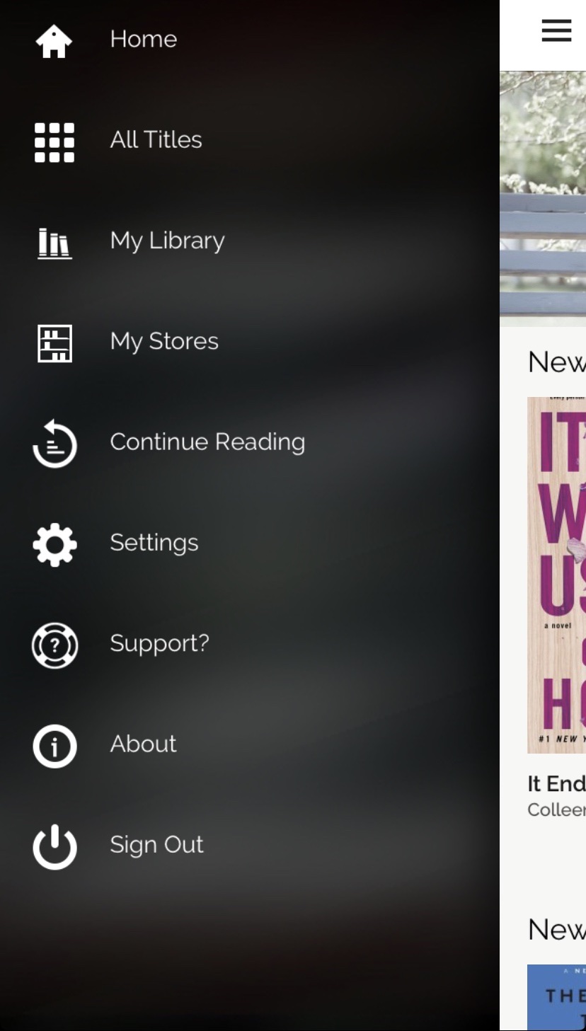
Actually it is showing you the list of books at whichever store you logged in as. Because these are services that tie together different bookstores you could actually have multiples. I bought mine through Bookshop.org so only have the one. Any book I purchased from Bookshop.org would show up here. MyMustReads however is not a service solely for that one site. By clicking on the hamburger icon in the upper left you can navigate around to other areas more easily to other areas.
I only tested this with one purchased book that I read throughout the test. If you were in the middle of reading something on this device then before bringing up the library screen it will ask if you want to just continue reading. This is the equivalent of the “Continue Reading” menu option. More often than not this is how my journey in the app began.
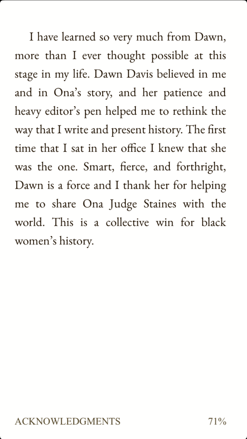
Within the book you have the typical page view. Below is a screenshot of the rendering of a page from the book I tested with:
Going back and forth between pages is done by swiping left or right. If you single tap on the page you can toggle whether a top menu bar and bottom navigation bar are available, as seen below:
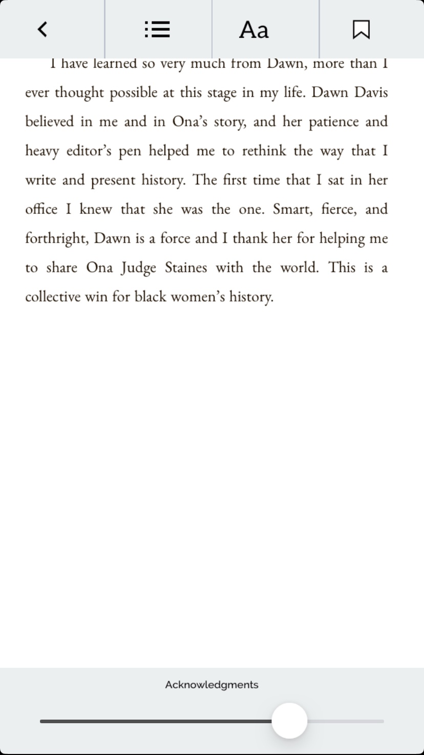
The bottom navigation bar allows the user to scroll to any part of the book instantly. The four buttons on the top are:
- Close the book with the back arrow button
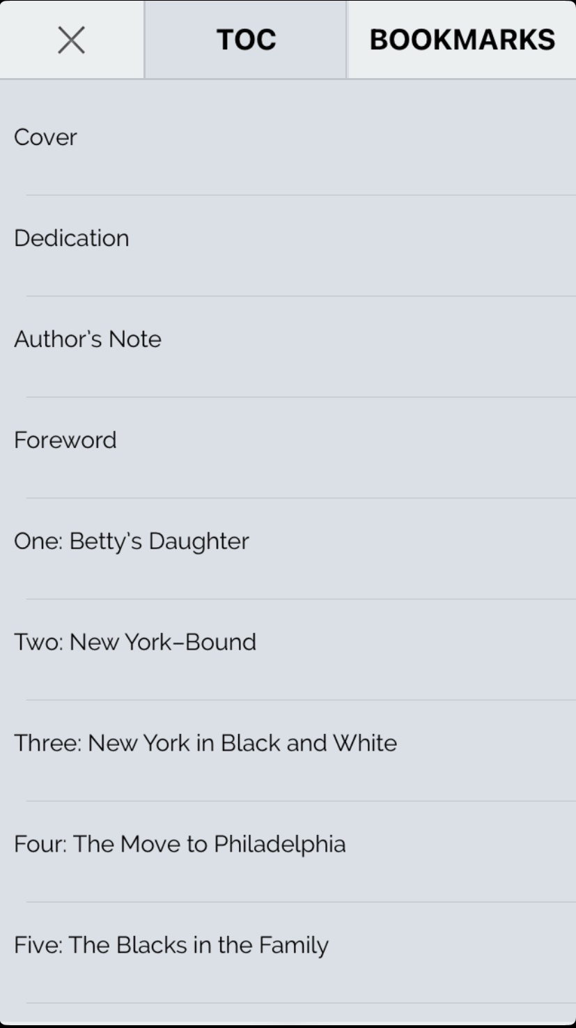
- Bring up the table of contents with “TOC” button
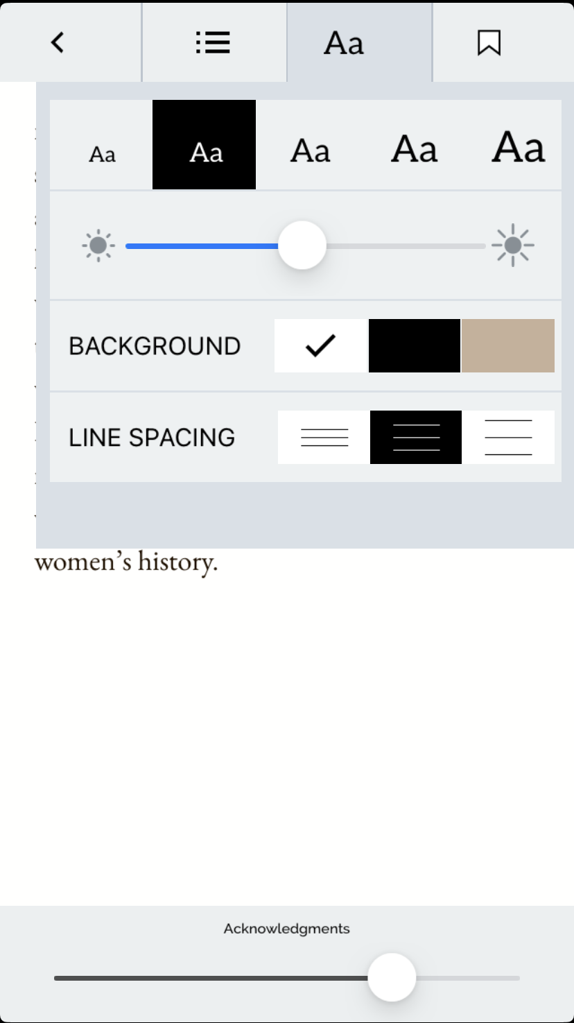
- Change the display settings with “Aa” button
- Add a bookmark to the current page with the bookmark icon button
The table of contents view is pretty simple, and clicking on any of the items brings the user directly to the beginning of that chapter as expected:
Lastly the display settings can be somewhat configured:
Review
Overall the application is very usable. I was able to successfully read the book from start to finish mostly without incident. The process of tying in the purchase to my Bookshop.org purchase was flawless as well. It always remembered my position when I would bring the book back up and never got confused about any time travel issues. That is, some readers seem to not remember the last position but instead a position from a while before since it didn’t properly sync the data. None of that happened here but I imagine a big reason for that is that there is no concept of cloud sync or cross-device position information. That shows up as a big issue further down.
With the positives out of the way I wanted to get to some of the negatives. The simplest and most easy to ignore negative is that the page turning feels clunky. It is an all or nothing transition. Other readers make the display look like you are swiping between pages. So when you are half way through turning the page you actually have half of one page and half of another. I don’t necessarily need that level of rendering but some indication that you are in the process but not quite swiping enough for turning the page would be nice. What would be even nicer would be a continuous reading mode that other readers offer.
In fact display customizability and font selection is probably one of my biggest complaints. I’m not the biggest fan of whichever font. I don’t know if that is decided by the book publisher or is application wide. My problem is that at the scale I read it at the serifs look fuzzy as it is rendered. This is not my eyes, which are getting older, but really in the display. You can see that if you blow up the page example PNG file (so no compression issues either). I often swap out serif fonts for sans-serif fonts with heavier weight as well. This is impossible to do here since the font is fixed. Again it would be less important if I didn’t find the font a bit fuzzy on rendering. For someone who is dyslexic though it would be nicer if they could have control over the font to select one that is easier to read.
A related problem with the font selection is that the sizing seemed random when bringing the ap back up from a long time of not being loaded (hours or days). The menu option would show the correct option but the rendered size would often be wrong. Sometimes it was smaller than the smallest setting one could select. Whenever this happened I would literally click through each of the sizes until the system reset itself correctly. Then I’d select my preferred size. I’d say this happened about half the time when coming back from long times away. It never happened when I’d task swap away from the app while reading the book in a session though.
All of the above were things that made the experience not so great but there are two features that are real deal breakers for me. While I was able to find a way to read inside of the website it was a bit convoluted to initially set it up. This is partially an artifact of the each store being its own portal into the experience. However once I did set it up the reading location, etc. was distinct from on the device. My usual Kindle reading experience has me jumping between web reader on desktop (since they don’t have a Linux client) and an iPad and iPhone. Having no consistency between the two is a big problem. From their perspective this falls into the “bug not a feature” category. They address it in their FAQ under the “Will the place I left off reading sync across devices?” question. While I can see their point, this is a real kink in how I use ebooks. Probably related to that but another huge deal breaker for me is that there is no ability to highlight or annotate within the book.
When I’m reading I often highlight sections I find interesting. Sometimes associated with the highlight I add some notes for my thoughts etc. I can then browse my highlights and notes when I’m going back to find something. Without that ability I have a substantially reduced ability to use this when reading non-fiction books for research purposes. There isn’t even a search function to make it so that in the short term I could at least search for a term or expression that I may be interested in. If I could only have one of those features I’d pick the highlighting/notes though. If there is no concept of cloud synchronized data then there would need to be a way to extract that information into an independent form that could be exported from the device.
Conclusion
I really wanted to love this ebook ecosystem so I could have this as a good alternative to Amazon. I’m willing to make a lot of allowances and suffer through if need be in the interim if it crosses a threshold. For me the gaps are too big right now for me to suffer through much less for me to recommend to others as their main ebook platform. More concerning is the fact that the app seems pretty static right now. The last update was a year ago. These sorts of issues are pretty large, especially the font bug. It therefore makes it feel like this is considered feature complete and in maintenance mode at most. It really needs a lot more development though. If it were open source then I’d consider contributing to it if the stack was in my wheelhouse. I don’t believe it is though, at least as far as I can see. That of course has my Flutter brain queueing it up for yet another thing to try to write in Flutter. In reality the web version may be enough for me to give it another try on another book and hope that the ebook reader starts improving. It would especially be not too bad for fiction books where highlighting and bookmarking isn’t a primary thing I do. I just wish the mobile app was in a better shape than it is so I could switch myself to it more fully at least if not make a recommendation to others.