


 2017-02-27
in
2017-02-27
in

 1 min read
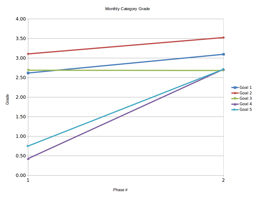
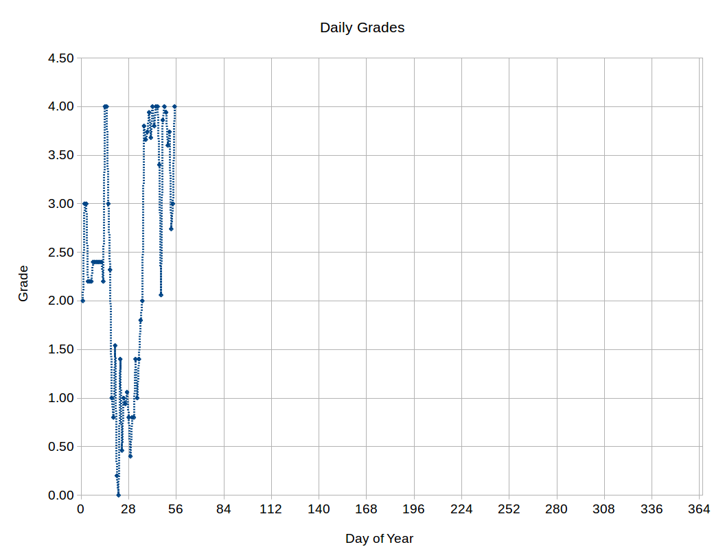
While using the Goal Accountability Project as a means of keeping myself honest on where I am with my health it occurred to me that a graphical punch is as important as a daily check in. It’s one thing to look at a table of numbers and see that I haven’t been hitting the marks I want. However it is of far greater impact when you see a picture of it. As the old saying goes, a picture is worth a thousand words.
To capture these trends I’ve created two different plots. The first plot shows the monthly average grade for each of the five categories for each of the Phases of the project. This gives a good-by-the-category snapshot of whether I’m getting better or worse on one particular category. The second chart is the daily GPA across those five categories. This is a very easy way to show how well I’m generally adhering to the goals over time. It’d be too busy to show each grade every day and I really want to be doing well across the board not just on one particular category. So with these two plots I can track how well I’m adhering to my goals over the year.