


 2019-06-11
in
2019-06-11
in

 9 min read
There are many ways to lay out UI elements in Avalania from the StackPanel
, which stacks things on top of each other or along side each other, to the Canvas
which allows one to specify the exact pixel position of any element. The Canvas may sound like the way one would want to go because it gives the most control but in actuality it’s overl prescriptive. If you notice carefully how most user interfaces work they dynamically resize as windows are resized. They try to maintain a sense of proportionality with the drawing area being given to its window. The rigidness of the pixel-based system is sometimes useful but more often than not the panel type you’ll be wanting to use in Avalonia is the Grid
. Here is the Part 1 of a multi-part series on the features of the grid and how to use it. You can find the final solution for this blog post in this Gitlab Repository
.
NOTE: This article is from 2019 and Avalonia has been under active development and improvement since that time. Please consult newer tutorials and documentation for how to use this against current releases of Avalonia.
Getting Started
Let’s start with the simplest step, creating a component. We are going to be using simple (TextBox)[http://avaloniaui.net/docs/controls/textbox] controls to fill our grid and easily show how things are laid out and drawn. First, create a new project using the steps in Getting Started
:
dotnet new avalonia.mvvm -o BasicGridLayoutExample -n BasicGridLayoutExample
Next lets edit our MainWindow.xaml file to have a grid. For this part we will be doing all of our work in this one file and using preview and/or compiling and running the app to see the results. The below XAML will create an initial 4x4 grid of components for us to begin worknig with:
<Window xmlns="https://github.com/avaloniaui"
        xmlns:x="http://schemas.microsoft.com/winfx/2006/xaml"
        xmlns:vm="clr-namespace:BasicGridLayoutExample.ViewModels;assembly=BasicGridLayoutExample"
        xmlns:d="http://schemas.microsoft.com/expression/blend/2008"
        xmlns:mc="http://schemas.openxmlformats.org/markup-compatibility/2006"
        mc:Ignorable="d" d:DesignWidth="800" d:DesignHeight="450"
        Width="800" Height="450"
        x:Class="BasicGridLayoutExample.Views.MainWindow"
        Icon="/Assets/avalonia-logo.ico"
        Title="BasicGridLayoutExample">
  <Grid RowDefinitions="100,100" ColumnDefinitions="100,100">
    <TextBox Grid.Row="0" Grid.Column="0" Background="Aquamarine" Text="Cell[0,0]"/>
    <TextBox Grid.Row="0" Grid.Column="1" Background="Beige" Text="Cell[0,1]"/>
    <TextBox Grid.Row="1" Grid.Column="0" Background="Lavender" Text="Cell[1,0]"/>
    <TextBox Grid.Row="1" Grid.Column="1" Background="White" Text="Cell[1,1]"/>
  </Grid>
</Window>
Let’s look at the various pieces. First, we see that we have a <Grid></Grid> component within which we are defining each of our four text boxes. When placing other controls in the grid we need to tell it which row and column it is supposed to belong in. This is where the Grid.Row and Grid.Column parameters on each of our TextBoxes comes in. As you can see these are zero-based indices. The Background is how we are setting the color and the Text is just to create a visual representation. It’s important that we define the grid within which we are laying out the components as well. This is most simply done with the RowDefinitions and ColumnsDefinitions properties on the grid itself. We will spend much of the rest of this exercise discussing that but for this example we created a very simple grid which has two rows of 100 pixels each and two columns of 100 pixels each. When you run your application it will look something like this:
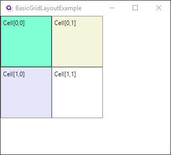
Avalonia Grid Control with 4 cells each of 100 by 100 pixels
This gave us exactly what we asked with each row being 100 pixels in height and each column being 100 pixels wide. The TextBox in each cell are inheriting their size from the cell they are in so fill the whole thing. While this gives us a lot of control we often don’t want to have to specify the row height or column with so directly. That’s a lot of bookkeeping. “What’s my largest component…let me make it that size…oh darn I forgot about…” We will let Avalonia do the work for us.
Auto-sizing of Grids and Columns.
Rather than specifying the size of a row or column we can tell Avalonia to calculate it based on the contents that they are trying to display by using the Auto keyword instead of the pixel size. For our first example it’d look something like RowDefinitions="Auto,100" if we wanted the first row to have a height that is determined by the size of the contents rather than a specific size. Let’s look at an example of this where the first row and column are autosized:
<Grid RowDefinitions="Auto,100" ColumnDefinitions="Auto,100">
  <TextBox Grid.Row="0" Grid.Column="0" Background="Aquamarine"
           Width="200" Height="300"
           Text="Cell[0,0]"/>
  <TextBox Grid.Row="0" Grid.Column="1" Background="Beige" Text="Cell[0,1]"/>
  <TextBox Grid.Row="1" Grid.Column="0" Background="Lavender"
           Width="100" Height="100"
           Text="Cell[1,0]"/>
  <TextBox Grid.Row="1" Grid.Column="1" Background="White" Text="Cell[1,1]"/>
</Grid>
The first row and first column are now being told to determine their size by the components within them but the second row and column are still explicitly set to 100 pixels. You’ll notice that we now have explicitly set the height and width of the two textboxes that make up the first column. We made the one in the first cell much larger, 200x300 pixels, than the second, at 100x100 pixels. The second is essentially the same size as it would have been in our first example but explicitly sized. With the Auto keyword Avalonia is calculating the minimum height needed for every component in that row and and the same calculation for the width of the first column. The TextBox in Cell (0,1) will scale to whatever it is told so in the first row it is the explicit height of 300 that is used. For the first column both of the TextBoxes specify a width but the first one, at 300 pixels is bigger so wins. When it comes time to render therefore the first row and column fit the TextBox in Cell (0,0) perfectly. The TextBox in Cell (0,1) takes what it’s told and scales to fill it. However the Cell (1,0) TextBox is very explicit about its size. The remainder of the width for it’s cell remains unfilled and the Textbox itself is just centered on the cell, which is the default behavior.
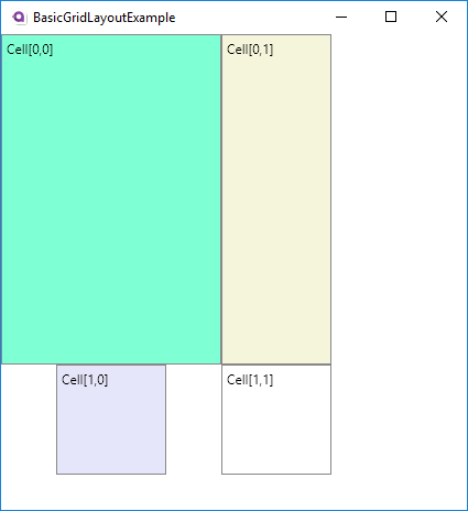
Avalonia Grid with auto-caled first row and column
Couldn’t we have just set the first column explicitly? Yes, but it is often the case that those sizes change over design time and having it scale automatically becomes a great time savings very quickly. The big take aways for auto-scaling are:
- Auto-scaling determines necessary size for biggest components and uses it
- Components with inherited dimensions will auto-scale to fill their cell
- Components with fixed dimensions will retain size and “float” within their cells
We have gotten ourselves in a better position for easily making UIs but if you expand/contract the window you’ll see that the cell sizes remain fixed still. How does one make it so the grid can automatically change as the drawing area of the window changes? We will do that with Proportional scaling.
Proportional Scaling
Like the Auto keyword we signify proportional scaling with the string * but it’s a bit more complicated than that. Let’s start simply and work our way forward. Let’s go with our previous example slightly changed so that we are only specifying the size of the first cell’s TextBox and we are telling Avalonia to auto-scale the first row and column and proportional scale the second row and column:
<Grid RowDefinitions="Auto,*" ColumnDefinitions="Auto,*">
  <TextBox Grid.Row="0" Grid.Column="0" Background="Aquamarine"
           Width="200" Height="300"
           Text="Cell[0,0]"/>
  <TextBox Grid.Row="0" Grid.Column="1" Background="Beige" Text="Cell[0,1]"/>
  <TextBox Grid.Row="1" Grid.Column="0" Background="Lavender" Text="Cell[1,0]"/>
  <TextBox Grid.Row="1" Grid.Column="1" Background="White" Text="Cell[1,1]"/>
</Grid>
This will produce a window that looks like this:
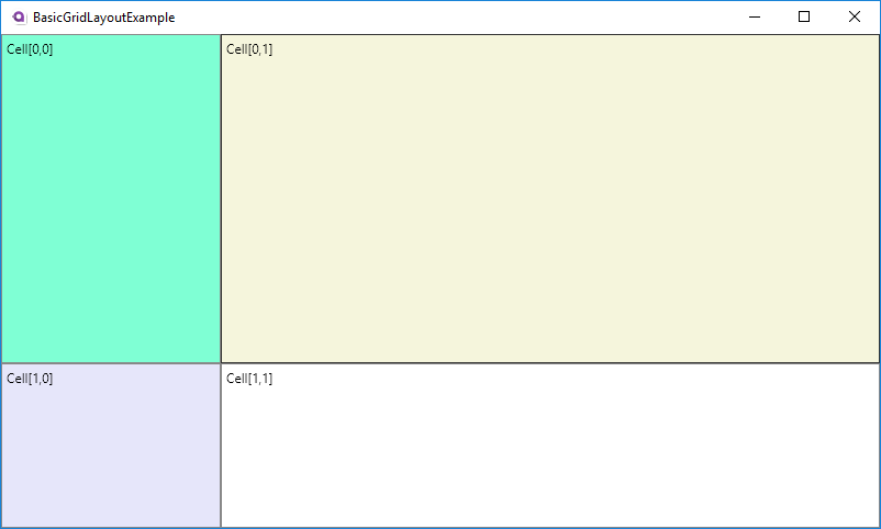
Avalonia Grid simple proportional scaling
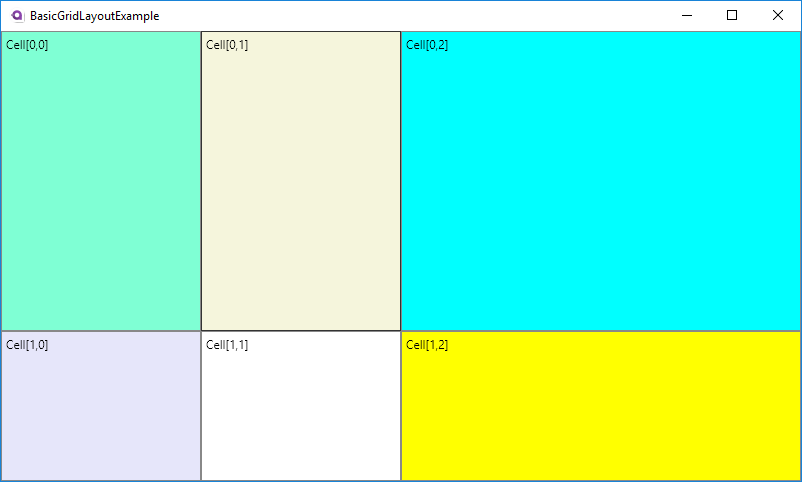
As you play around with resizing the window you’ll see that sure enough the width of the second row and height of the second column change to fill the rest of the window while the height and width of the first stay the same. This is the holy grail we were looking for where we make use of our whole application. However beyond simple applications it’s often going to be necessary to have proportional scaling of several rows and columns. How will those interplay? As I said it’s a bit more complicated than just having Auto because Avalonia gives us the ability to specify the proportionality of each. Let’s say for example we have three columns, one fixed and two floating. Let’s say we want one floating column to be twice as big as the other. We can do that very simply by putting numbers in front of our * to denote the proportionality:
  <Grid RowDefinitions="Auto,*" ColumnDefinitions="Auto,10*,20*">
    <TextBox Grid.Row="0" Grid.Column="0" Background="Aquamarine" Width="200" Height="300" Text="Cell[0,0]"/>
    <TextBox Grid.Row="0" Grid.Column="1" Background="Beige" Text="Cell[0,1]"/>
    <TextBox Grid.Row="0" Grid.Column="2" Background="Cyan" Text="Cell[0,2]"/>
    <TextBox Grid.Row="1" Grid.Column="0" Background="Lavender" Text="Cell[1,0]"/>
    <TextBox Grid.Row="1" Grid.Column="1" Background="White" Text="Cell[1,1]"/>
    <TextBox Grid.Row="1" Grid.Column="2" Background="Yellow" Text="Cell[1,2]"/>
  </Grid>
So here we have the third column being twice as large as the second column. Why did we use “10” and “20” not “1” and “2” or “200” and “400”. Usually for something simple like this you’d see the arguments as Auto,*,2*. When you don’t specify a number it’s automatically one. I’m using 10 and 20 to prove the point that it’s all about the ratio of the two numbers and nothing more. Sure enough if you looked at the rendered window you see that the second column is half the size of the third column:
Avalonia Grid simple proportional scaling with multiple columns
If math is scary or something you don’t want to have to worry about anything more than the rule of thumb that a row/column’s size is just the ratio of its leading number to the biggest row/column’s leading number. So in our example the second one’s ratio is (10/20) = 0.5 = 50%. If we had another column that was set to 5* so it looked like Auto,10*,5*,20* it would be (5/20) = 0.25 = 25% of the size of the biggest column. I’m going to dive into the actual math below.
Avalonia Proportional Scaling Math
What’s really going on from a math perspective is that the “free space” of the given row/column is calculated and then divided up among the various proportional columns proportionally to their ratios. So in the example above we had 800 pixels in our window and 200 pixels of that were allocated for the first column specifically. There is then 600 pixels that will be used for all of the proportional scaling. How are those pixels divided up? It’s a very simple formula:
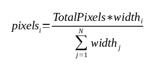
The proportional sizing of Avalonia Grids is simply the ratio of the size to sum of all sizes
So with this formula if you want to know how big any one row/column is you take its multiplier and divide it by the sum of all the multipliers combined. You then apply that to the number of pixels that are available for all proportional rows/columns in the grid and you have your answer. For this particular example it plays out like this for the XAML below that:
| Column # | Setting | % Setting | Pixels | % Pixels |
|---|---|---|---|---|
| 1 | 1 | 10% | 60 | 10% |
| 2 | 4 | 40% | 240 | 40% |
| 3 | 2 | 20% | 120 | 20% |
| 4 | 3 | 30% | 180 | 30% |
| Total | 10 | 100% | 600 | 100% |
  <Grid RowDefinitions="Auto,*" ColumnDefinitions="Auto,*,4*,2*,3*">
    <TextBox Grid.Row="0" Grid.Column="0" Background="Aquamarine" Width="200" Height="300" Text="Cell[0,0]"/>
    <TextBox Grid.Row="0" Grid.Column="1" Background="Beige" Text="Cell[0,1]"/>
    <TextBox Grid.Row="0" Grid.Column="2" Background="Cyan" Text="Cell[0,2]"/>
    <TextBox Grid.Row="0" Grid.Column="3" Background="Magenta" Text="Cell[0,3]"/>
    <TextBox Grid.Row="0" Grid.Column="4" Background="LightBlue" Text="Cell[0,4]"/>
    <TextBox Grid.Row="1" Grid.Column="0" Background="Lavender" Text="Cell[1,0]"/>
    <TextBox Grid.Row="1" Grid.Column="1" Background="White" Text="Cell[1,1]"/>
    <TextBox Grid.Row="1" Grid.Column="2" Background="Yellow" Text="Cell[1,2]"/>
    <TextBox Grid.Row="1" Grid.Column="3" Background="LightGray" Text="Cell[1,3]"/>
    <TextBox Grid.Row="1" Grid.Column="4" Background="Coral" Text="Cell[1,3]"/>
  </Grid>
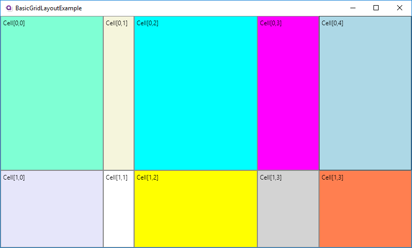
Avalonia Grid simple proportional scaling with multiple columns
Conclusion
With the above tools you’ll be able to create some UIs with the appropriate flexibility that you need. In the next part we will go into some more advanced features of Grids.